
I’ve grown more and more interested in learning how to level up my infographic and data visualization game on Startup Stumbles.
These types of high impact graphics are not only useful to help communicate advanced concepts – if done correctly they can be highly shareable and linkable.
The really good ones can even establish instant credibility for a site.
This isn’t a particularly new insight for anyone in the niche site world. And yet, every single one of us seem to use the exact same Canva shapes, images, elements and templates…over and over and over again.
So, last week I started doing a little digging.
My first objective was to find examples of content creators and sites who are absolutely crushing it in this space.
I wasn’t looking for good. I was looking for GREAT.
Visual Capitalist
With the goal of “Making the world’s information more accessible”, Visual Capitalist has the most consistently impressive and impactful data-driven visuals I’ve ever come across.
Hands down. And it’s not particularly close.
The team has amassed over 1.4M followers across socials and organic traffic appears to be north of 500,000 per month.
Their impressive growth becomes less surprising when you start to analyze some of their work.
Take this recent breakdown of “The Rise and Fall of WeWork” for example…
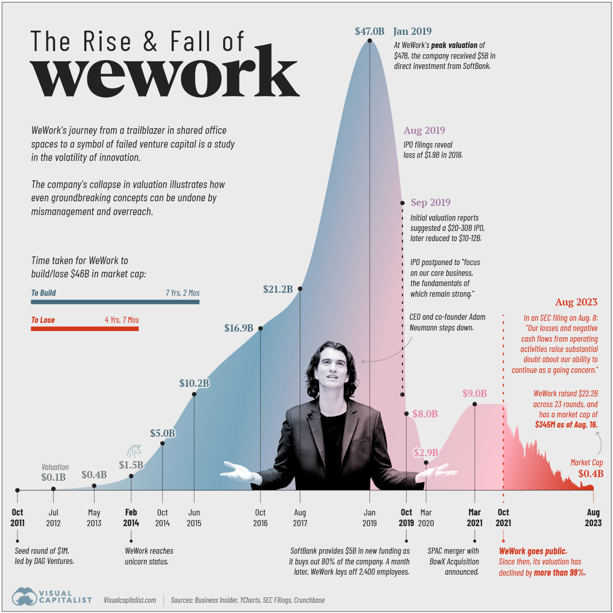
The amount of useful information their team was able to get into this one visual output is incredible.
This is a prime example of how to turn data into a story.
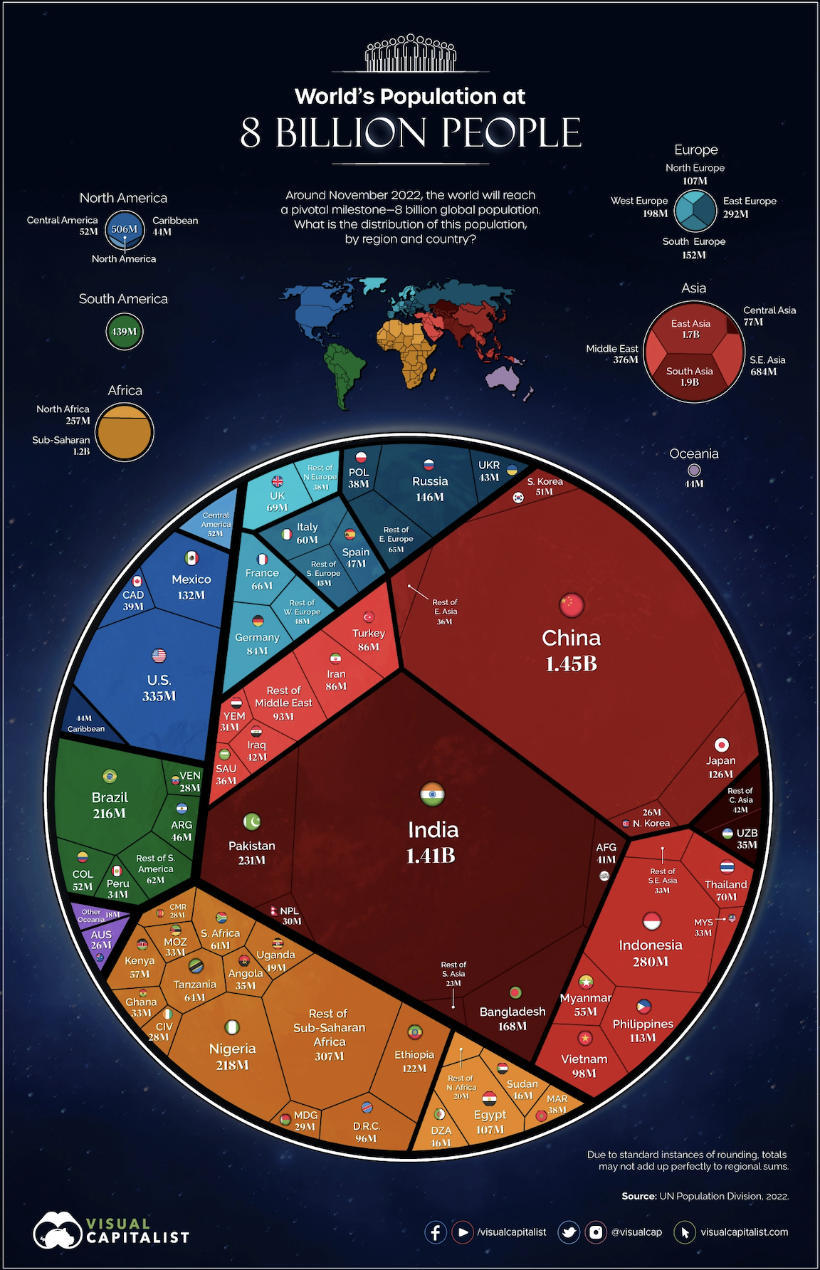
Or, how about this distribution breakdown of the world’s population of 8 billion people by region and country?
They seem to produce hit, after hit, after hit on broad ranging topics including markets, technology, energy and the global economy.
What’s insane to me is the company is independently owned by founder and Editor-in-Chief, Jeff Desjardins who’s never taken on any outside investments.
Even cooler is the vast majority of their graphics rely on publicly available data sources like the U.S. Census data, FRED, IMF, World Bank, etc.
They then ingest the data and use Adobe Creative Cloud (especially Illustrator) to communicate that same information in a fresh and more accessible way.
Synergy Sports
Visual Capitalist is clearly growing a fairly broad media empire.
Let’s niche down a bit. 😉
The reality is data is everything, and everything is data.
Which is good news. Because that means pretty much regardless of the niche you are in or will one day pursue, data-driven visuals can almost certainty help elevate your content.
Take Synergy Sports and Todd Whitehead for example.
Previously a Cal-Berkeley PhD and academic researcher, Todd is now the “data visualization king” of basketball Twitter.

One of Todd’s more interesting works is this 3-D model of Steph Curry’s record-breaking 2974 career three-pointers.

He stacked up one tiny plastic tray for each trey Curry had hit in his career to break the NBA record.
The whole thing literally took him weeks to finish!
It never ceases to amaze me how wildly creative people can be.
What’s Next?
It’s very likely I’ll never reach the level of Jeff and Todd.
But that’s exactly why I like to start by taking inspiration from the best.
Because even if I only achieve a fraction of their quality, it will still be better than the majority of what’s currently out there.
There are two initial use cases I plan to pursue for Startup Stumbles:
- Graphical representations of store location openings and closures overtime for some of the more historic businesses (i.e. Radioshack, Kmart etc.)
- Helping to make sense of the dense financial data located in most of these businesses’ eye-watering Chapter 11 filings
I’m also excited to start playing around with some of the leading data visualization tools.
*If anyone has any strong recommendations, give me a shout!*
Have a weekend!! ✌️
-Keith

Niche Twins newsletter sent weekly on Fridays at 8:30 AM ET